
Telling Stories With Data - Assignments 3 and 4
Critique by Design
Step 1: Find a data visualization (with data you can use!)
I am a big fan of cricket, especially when it comes to the ICC (International Cricket Council) T20 World Cups and the IPLs (Indian Premier League). The 2022 ICC Men's T20 World Cup recently concluded in Australia on 13th November 2022. Unfortunately, my team (Team India) did not win, but it gave a good fight and made it to the semi-finals! I enjoyed watching the matches in this World Cup.With cricket still in the air these days, and this assignment coming up, the best place I thought to search for (bad) visualizations was ESPNcricinfo. It is a sports news website exclusively for the game of cricket. It features cricket articles, cricket news, live cricket matches, and a historical database of cricket matches played from the 18th century to the current times. An additional reason this website was my first resource was because I had seen poor visualizations earlier on ESPNcricinfo.
During my exploration, I came across a page titled Which top cricket city would win the World Cup? First of all, the title of the page itself was confusing since the world cup matches are played between countries and not between cities. Based on the design and critiquing knowledge I have gained so far in the course, upon glancing through the page, I found some poor and misleading visualizations and decided to work on one of them for this assignment.
I planned to work on the visualization titled 'Cities with best Batting averages' since it has a significant area for improvement. But as a bonus 🌟, I planned to parallelly work on the visualization titled 'Cities with best Bowling averages' since the two were quite related and had similar areas of improvement. Both these visualizations are shown below.
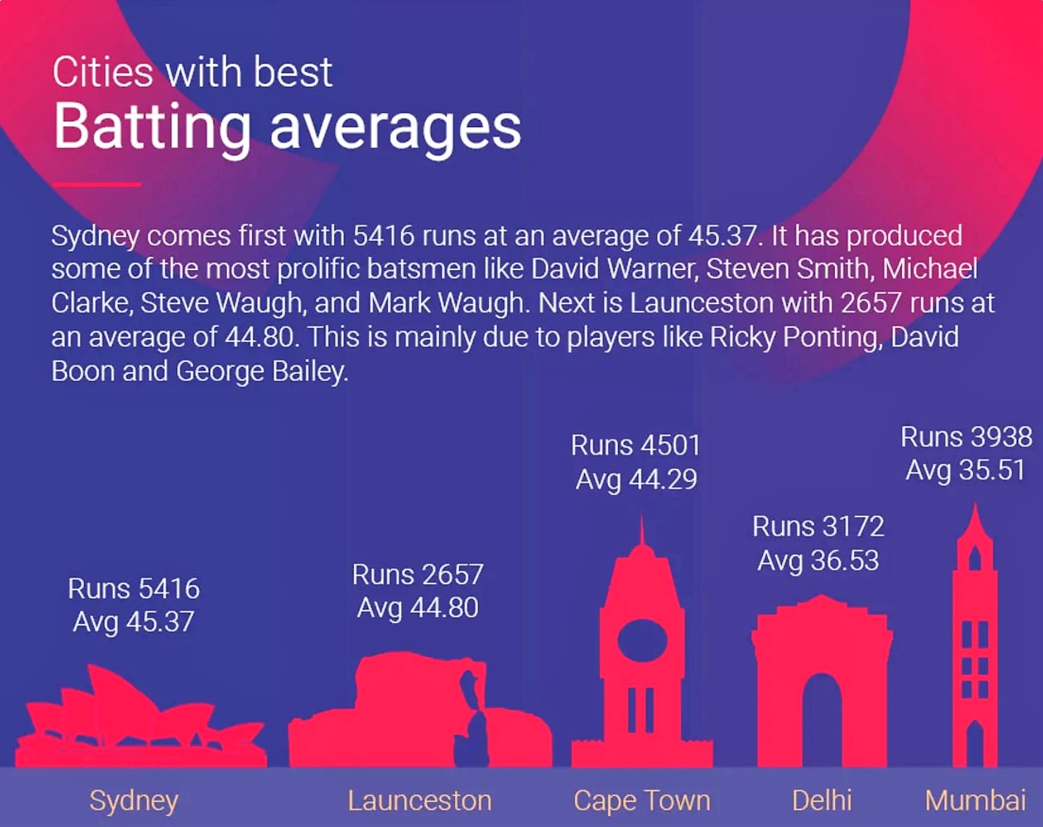
Source: ESPNcricinfo
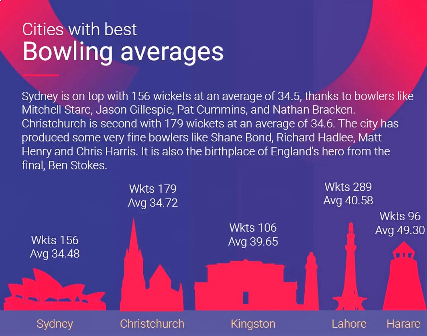
Source: ESPNcricinfo
Dataset Explanation 📝
- The data for these visualizations is open source and describes the batting and bowling performances of the top cities in the 2019 ICC Cricket World Cup.
- Though the cricket World Cups are played among countries, these visualizations focus on a different aspect. They compare the performance of the cities in these countries, which is, in turn, measured by the performance of the players that the city produced.
- The intended audience for these visualizations (and the data) are people interested in cricket. This is because they heavily contain technical jargon related to cricket which is not easily understandable by people who do not have a background in cricket.
- The data points in the visualizations are batting average, bowling average, runs, and wickets. These are cricket heavy and can be better understood from the detailed explanation given in this link. However, in simple terms, if you are batting, you try to score as many runs as possible and save your wickets. But if you are bowling, you try to take the wickets of the opponent team and make them score as few runs as possible. If you lose your wicket, you are 'out'.
- Batting average is the ratio of the total number of runs scored by a player to the number of times the player has been out. Bowling average is the ratio of the number of runs conceded by a player to the number of wickets taken by the player. These averages are calculated on a player basis and are then averaged (for the players from a given city) to find the averages of the respective cities.
- The source of these visualizations does not have a built-in data set (in tabular form). However, the data set was easily reconstructable based on the values in the visualizations. Thus, I (easily) recreated the data set for building my sketches and the final visualizations in Flourish.
Citations
- Data Source: ESPNcricinfo
Step 2: Critique the data visualization
As a part of the assignment, I was required to critique the original visualization using Stephen Few's Data Visualization Effectiveness Profile. Stephen proposed seven criteria for evaluating the effectiveness of a data visualization. These seven criteria are divided into two broad categories: 'Informative' (Usefulness, Completeness, Perceptibility, Truthfulness, Intuitiveness) and 'Emotive' (Aesthetics, Engagement).
The metrics under Informative help measure the effectiveness of the visualization in producing understanding to the audience. And the metrics under Emotive help measure the effectiveness of the visualization in producing a proper emotional response to the audience. I critique the original visualizations below.
Informative 📊
1. Usefulness
Is it useful for the intended audience? Does it communicate valuable information?
- The visualizations are helpful to the intended audience (cricket lovers), and they communicate relevant information (with additional efforts from the audience). However, they are not the best at conveying relevant information.
- At first site, considering the graphics in the visualizations, it seemed to me that the visualizations were trying to compare the sizes of the famous monuments across the cities!
2. Completeness
Does the visualization have everything necessary to make it understandable?
- The visualizations are lacking in several aspects and thus are not complete to convey the entire information.
- First of all, the title itself is incomplete. It does not state the year or the cricket tournament for which the visualizations were made.
- Further, they contain irrelevant information, which adds to the complexity and reduces their completeness. Our primary focus is to compare the batting and bowling averages of the best cities. Considering this, I do not find the details about runs ('Runs') and wickets ('Wkts') appropriate in this context.
-
Moreover, some of the sentences in the text are not required
to convey the message that these visualizations aim for.
Some examples of such sentences include the following:
"It is produced some of the most prolific batsman like David Warner, Steven Smith, Michael Clarke, Steve Waugh, and Mark Waugh."
"The city has produced some very fine bowlers like Shane Bond, Richard Hadlee, Matt Henry and Chris Harris."
"It is also the birthplace of England's hero from the final, Ben Stokes." - The extensive vocabulary in the visualizations details the message that these visualizations are trying to convey. It directly supports that these visualizations lack clarity and thus demand further explanation by using text.
3. Perceptibility
Can the reader understand the information with minimal effort? Is the visualization type appropriate? Does it use illogical comparisons?
- It took me a lot of effort to grasp the information these visualizations were trying to convey.
- There is a lot of unnecessary detail in the visualizations. The 3-4 line explanations are not needed. Moreover, the respective graphs do not require data about runs and wickets. Further, the titles of the visualizations could be more precise and complete.
- The chosen visualization type is not appropriate as well. Choosing the graphics of the famous buildings (in the cities) to represent the respective cities is not apt in this context. First of all, the users might need to be made aware of the buildings. Next, buildings representing the cities add a historical/monumental touch to the visualizations. As soon as I see famous monuments and values on top of them, I am motivated to think that these visualizations are comparing the heights of famous monuments across the cities.
- The buildings are of various sizes, and placing the data points above these buildings brings an illogical comparison. It is human nature to think that taller objects should have more value than shorter objects. However, this does not hold true in this context. At multiple points, we observe that taller objects (buildings) have lesser values (batting average, bowling average, runs, wickets) than shorter objects.
4. Truthfulness
Is the visualization accurate, reliable, and valid? Is it representing what it says it is, and in the most complete and truthful manner? Does it misrepresent the data or make comparisons that aren't correct?
- As a cricket fan, I find the data accurate; however, I do not find the visualization reliable. It seems attractive but can be misleading at first sight.
- The different-sized objects (buildings) used to represent the cities (having different bowling and batting averages!) highlight comparisons that are not correct and thus misrepresent the data.
- The above insights, the incomplete titles, multiple irrelevant information, and the heavy use of dark pink and violet (in the background) colors do not help convey the message entirely and truthfully.
5. Intuitiveness
Is it easy to understand and clearly communicates the information? If unfamiliar, does it include easy to understand instructions on how to interpret it?
- I find the visualizations challenging to understand since they have used graphics (of various sizes) to represent something straightforward. The graphics represent famous monuments in the respective cities; however, it would require more work for the audience (even cricket lovers) to correctly identify them. Even I did not know some of them!
- Such visualizations are not familiar to a large audience. The graphics are distracting and irrelevant to the context and message. Moreover, there is no additional information provided to better interpret the visualizations.
Emotive 💝
6. Aesthetics
Is it interesting/enjoyable to look at? Is it a good example of what a beautiful data visualization might look like? Is it somewhere in the middle - pleasing but otherwise not distracting to look at?
- At first sight, the visualization might appear attractive, but later, it takes a lot of time to get value out of these visualizations.
- The visualizations are pretty dull with the choice of colors. Moreover, there is a considerable amount of text in them.
- The abbreviations used to highlight the data points (Eg: 'Wkts' and 'Avg') might be known to a small audience. Having some knowledge about cricket and math, I could figure out that 'Wkts' is 'Wickets' and 'Avg' is 'Average'. But this might only hold for some cricket lovers.
- There is a lot of repetition for each data point. The words 'Runs', 'Avg', and 'Wkts' are repeated for each data point. They add to the complexity and disturb the aesthetics of the visualizations. The repetition indicates that the message is not easily conveyed to the audience.
- The background is filled with violet, making me feel sleepy 😴💤 by staring at it for a long time! Painting the whole background violet was an incorrect choice.
- The labels on the x-axis are colored brown with a violet background. Unfortunately, they hide in the background and do not stand out nicely.
7. Engagement
Does it lead the audience to learn more about the topic? Does it inspire the audience to talk about the data or share it with others?
- The first look at these visualizations and the fancy graphics of the monuments might catch one's attention, but in line with the above discussion, they need more! The deficiencies (as discussed above) will not quickly motivate the audience to learn more about the topic or dwell deeper into the data.
- Being not a great visualization, it is not inspiring the audience to talk more about the data or share it with others. I would not be motivated to forward the link of the visualization to anybody.
Overall Observations
What stood out? 😃
- The graphics of the famous monuments in the cities stood out at the first site.
- The violet background color caught my attention.
- The dark pink color of the monuments grabbed my attention next.
- Finally, the large amount of text made its way to my eyes before I could start dwelling on what the visualizations had to say.
What worked well? 🤩
- The large graphics of the monuments worked well in catching the first attention.
- The large font size of the titles (somewhat) effectively conveyed what the visualizations were about.
- The values for each data point. Though they are not adequately represented, this worked out well because the visualizations would become useless without them.
What did not work well? 😕
- The background colored in violet.
- Incomplete titles of the visualizations. They missed the year and tournament for which the data was displayed.
- The huge amount of text (large sentences!) in the visualizations trying to convey the message.
- Use of graphics of the famous monuments in the cities to respectively represent the cities.
- Use of dark pink color in the graphics and the background.
- Repetitions in the data points. 'Runs', 'Avg', and 'Wkts' were over and over again!
- Use of abbreviations (for 'Avg' and 'Wkts') while representing the data points.
- X-axis labels colored in light brown on top of a dull violet background.
- The various heights of the graphical monuments.
- The irrelevant details about 'Runs' and 'Wkts' in the respective visualizations.
- Placing the data values on top of each graphical monument (of various heights).
What would you do differently? 📝
- Remove the background color.
- Update the titles of the visualizations.
- Use a bar graph instead of graphical monuments to represent the data points.
- Remove the hefty sentences from the visualizations.
- Remove the details about 'Runs' and 'Wkts' from each data point.
- Color the bars of the bar chart with relevant colors. I plan to use the national cricket team colors of the respective countries the cities are a part of. It would perfectly align with the theme of the Cricket World Cup.
Audience Analysis
Who is the primary audience for this tool? Is this visualization effective for reaching that audience? Why or why not?- The primary audience for these visualizations is cricket enthusiasts or people who know cricket.
- However, these visualizations have not come out to be effective in reaching out to the audience.
- If I (being a big cricket fan) were scrolling through my feed and came across these visualizations, I would not pause and think that these visualizations convey some helpful information about cricket. With the graphical monuments and numbers on top of each, I think of these as civic or historical graphs that compare the heights of various monuments across numerous cities.
- At one point, on a broader view, I also thought of these visualizations as some greeting cards of a festival (they closely reside with a few cards I sent to my friends this year of the occasion of the famous festival in India - Diwali...🪔). The monuments are no lesser than some attractive design on a greeting card, and a large amount of text suits the greeting message.
Final Thoughts
How successful was this method at evaluating the data visualization you selected? Are there measures you feel are missing or not being captured here? What would you change? Provide 1-2 recommendations (color, type of visualization, layout, etc.).- The above evaluation and critiquing techniques are efficient for my selected data visualizations. The evaluation method was detailed and helped evaluate various aspects of the visualizations.
- This approach is better than the Good Charts method. This critiquing approach has many more useful metrics to evaluate the visualizations than those used by the Good Charts method.
- The Good Charts method guides one from the first sight of the visualization to suggesting what is to be changed in the visualization. The quantitative evaluation then follows for two metrics, namely 'Design Execution' and 'Contextual Awareness'.
- I like Stephen Few's approaches better because they have much more quantitative evaluations covering multiple aspects of the visualizations. Further, all the quantitative evaluations can be placed in one chart to better understand the visualizations being evaluated.
- As a recommendation, I suggest adding 'Color' as an additional metric under the 'Emotive' category.
- I understand that we are evaluating 'Aesthetics', but I believe that Aesthetics is a much broader umbrella compared to Color. No doubt, we would evaluate Color when we are evaluating Aesthetics, but Color would be a small part of this evaluation.
- Aesthetics would measure much more, including orientation, layout, visual appeal, color, choice of visualization, size, shape, etc.
- Color, on the other end, would evaluate a very specific and extremely important aspect of the visualizations. Such specific evaluation of a particular and important aspect of the visualizations could also help drive the focus during the redesign phase of the visualization.
Recommendations:
Step 3: Sketch out a solution
To better convey the message of the original visualizations, I decided to incorporate the following changes in my initial sketches:- Type of Visualization: I changed the visualization type to bar charts and tree maps since they are much more straightforward to understand than the complex and disturbing graphical monuments in the original visualizations. However, upon comparing the bar charts and tree maps, I prefer going forward with bar charts, but I thought to decide upon this after testing them out with the interviewees.
- Title: I changed the charts' titles to make them more precise and effective in conveying the main takeaway to the audience.
- Irrelevant Information: I removed the irrelevant information from the charts including the long sentences and the repeated text ('Runs', 'Wkts' and 'Avg') for each data point.
- Color: This was an interesting decision! After some thought, I have colored the bars (in the bar chart) and areas (in the treemap) of the cities with their respective national cricket team colors.
- Background Color: The background color in the original visualizations was not required, so I have removed it from my sketches. It has made the sketches much more appealing.
- Legend: Since I have colored the bars/areas based on the national cricket team colors of the cities, I thought it would be better to include a legend describing the colors of the countries. It would help the audience who is not well versed with the national cricket team colors of the cities.
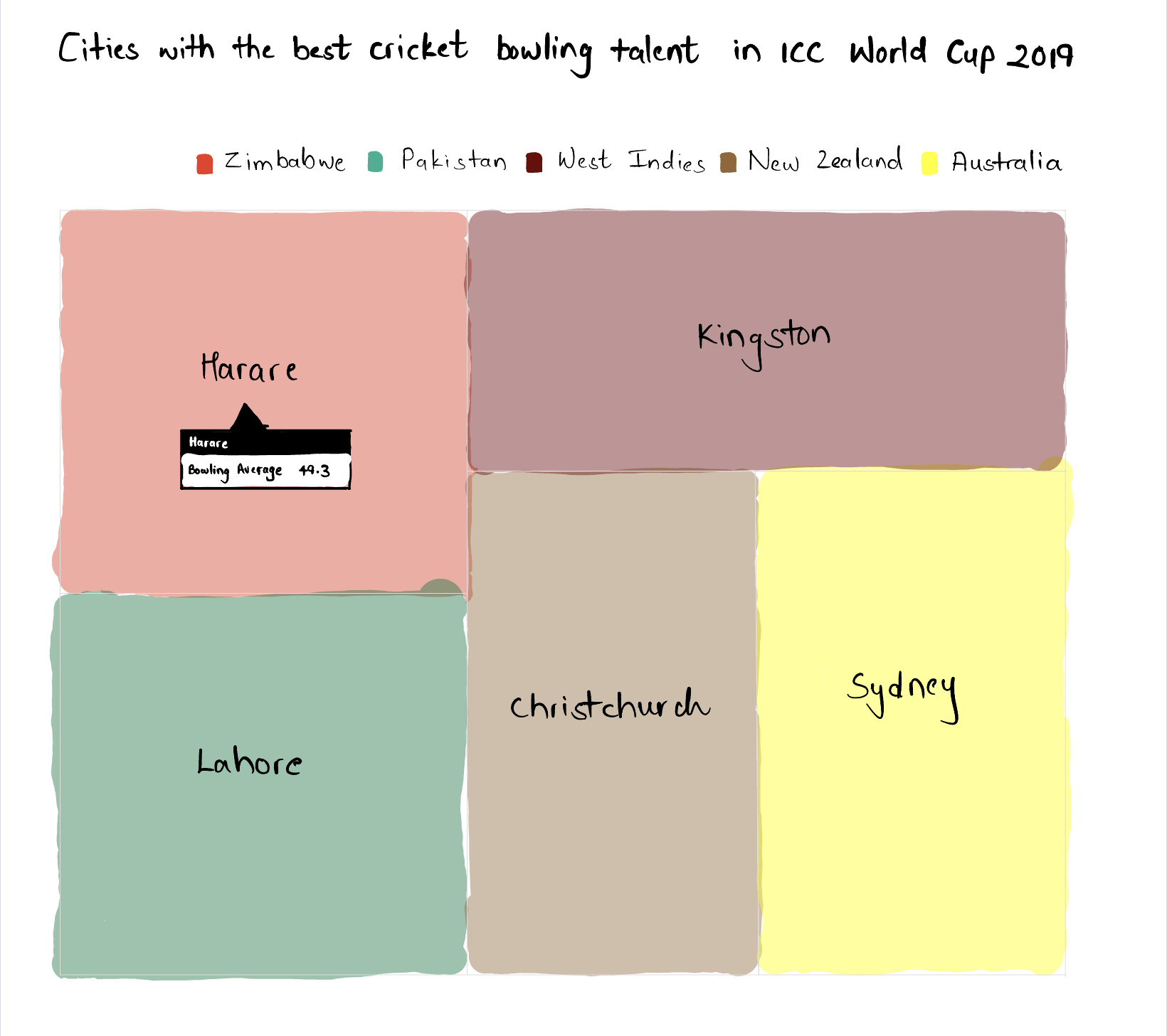
Below, I have paired the wireframes together so that the first wireframe in the pair is hand-sketched by me and the wireframe that follows the hand sketch is generated by Infogram.
Wireframes for the Main Visualization - Batting Talent
Bar Chart for the Main Visualization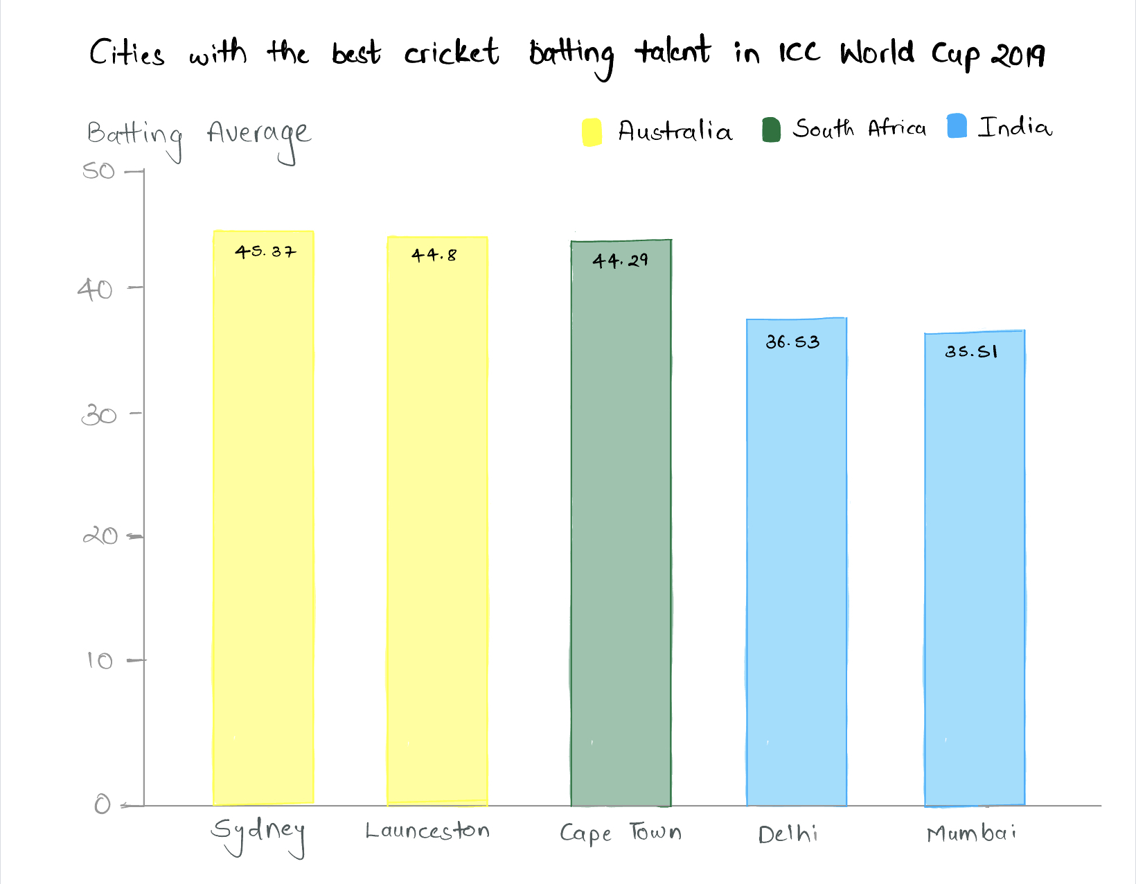
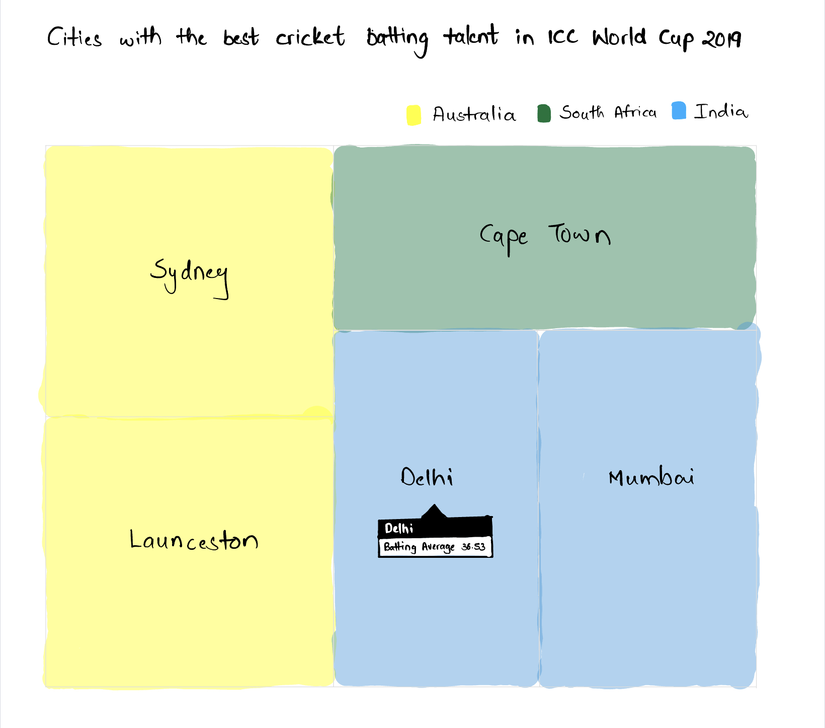
Wireframes for the Bonus Visualization - Bowling Talent
Bar Chart for the Bonus Visualization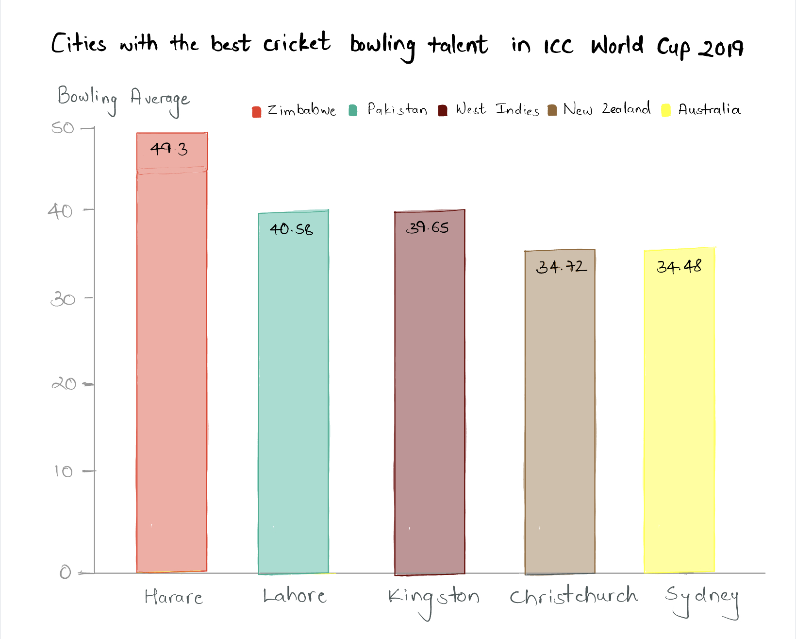
Step 4: Test the solution
To test my sketches and wireframes, I contacted 3 people with various backgrounds. I contacted 2 cricket enthusiasts and 1 non-cricket enthusiast so that I could get the views of both these types of people and could understand how my sketches reach out to them. All 3 interviewees that I chose were from different countries and had different professions. I shared with them the original visualizations and the wireframes generated in Infogram to review. I have detailed my interactions with the interviewees below.
Interviewee 1: Cricket Enthusiast | Mid 20's | Software Developer from India
Interviewee 2: Cricket Enthusiast | Mid 30's | Businessman in Australia
Interviewee 3: Not a Cricket Enthusiast | Mid 20's | Data Analyst from USA
Source for HTML Chat Template: Bootdey
Insights from the Interviews
Similarities
- The bar charts are better than the tree maps.
- The intended audience for the visualizations is cricket enthusiasts.
- The sketches have improved the original visualizations.
- The ordering of the bars in the bowling averages chart was misleading.
- The main idea of the visualizations was clear from the titles in the sketches.
- The first interviewee focused on improving the colors in the visualizations.
- The second interviewee focused on the ordering of the bars in the bar charts.
- The third interviewee, a data analyst, focused on many aspects of the visualizations, such as labels, legends, titles, sub-titles, and the organization of various elements in these visualizations.
- Bar charts are better than treemaps for this context.
- Sketches have improved the original visualizations.
- The ordering of the bars in the bowling averages chart is misleading.
- The titles in the sketches conveyed the charts' primary message.
- Compelling titles are beneficial in conveying the central message of the visualizations.
- Heights can be misleading in visualizations and should be used carefully.
- Even big companies like ESPNcricinfo can produce poor visualizations.
- (My favorite) This course is super relevant and important to me :)
Step 5: Build your solution
Design Changes After the Interviews
- I used Flourish to build my final visualizations.
- I removed the tree maps from my choice.
- I added the word 'Country' in bold to help the audience better understand the legends.
- Since the bars in the bowling average bar chart were misleading, I reversed the order of the bars to have lower bowling averages at the left and higher bowling averages toward the right.
- However, just reversing the order of the bars in the bowling average bar chart was not enough. I had to convey that lower bowling averages and higher batting averages are better. To do so, I updated the title of my y-axis in both the bar charts to the following - Batting Average (higher the better) and Bowling Average (lower the better).
- I added a footer defining batting average and bowling average to help these visualizations connect to a broader audience.
Updated Visualizations after the Interviews
Step 6: In-class peer review and feedback
What worked? 🤩
- The use of color worked exceptionally well. The decision to color the bars based on the national cricket colors of the respective countries was well appreciated.
- The visualizations would be suitable for even those who are not big cricket fans.
What didn't work? 😕
- The font size of the y-axis title was too small. The words 'higher the better' and 'lower the better' are essential in charts and should be appropriately highlighted.
- It was initially suggested to increase the font size of the y-axis title. But later, the peers suggested highlighting these words in the subtitles of the charts since they play a significant role in conveying the message.
- The numbers in the bars are not distracting, but it is better to keep them at the top of the bars rather than inside the bars. This would make the bars entirely visible.
- The footers are hanging below. Since they are defining essential terms in the charts, they can be connected to the Batting Average and Bowling Average using an asterisk (*) symbol.
What questions came up? 🙋🏻♂️
- Pretty much none!
What new inspiration arose? 😃
- Linking the national cricket team color to the bars was found insightful!
- The cricket theme was interesting to all my peers since mostly nobody knew about cricket before. It lead to some fun discussions later on.
Step 7: Final solution
Changes for the Final Re-Design
- I added a subtitle for the respective bar charts to highlight the fact that higher batting averages and lower bowling averages are better.
- The font size of the title of the y-axis was increased.
- The words, (higher the better) and (lower the better) were removed from the respective y-axis titles.
- The y-axis titles were connected to the footer notes using an asterisk (*) symbol.
- The numbers inside the bars were moved outside, to the top of the bars.
Final Re-Design of the Original Visualizations
Final Re-Design of the Main Visualization
Final Re-Design of the Bonus Visualization
Portfolio Navigation 🏃🏻
- Home Page: Going back to the start...
- Assignment 1: Setting up an online portfolio for the course (this website!)
- Assignment 2: Visualizing Government Debt
- Final Project - Part 1: Ideating the Project
- Final Project - Part 2: Creating Storyboard and User Research
- Final Project - Part 3: Incorporating User Research and Final Touches