
Telling Stories With Data - Final Project: Part 1
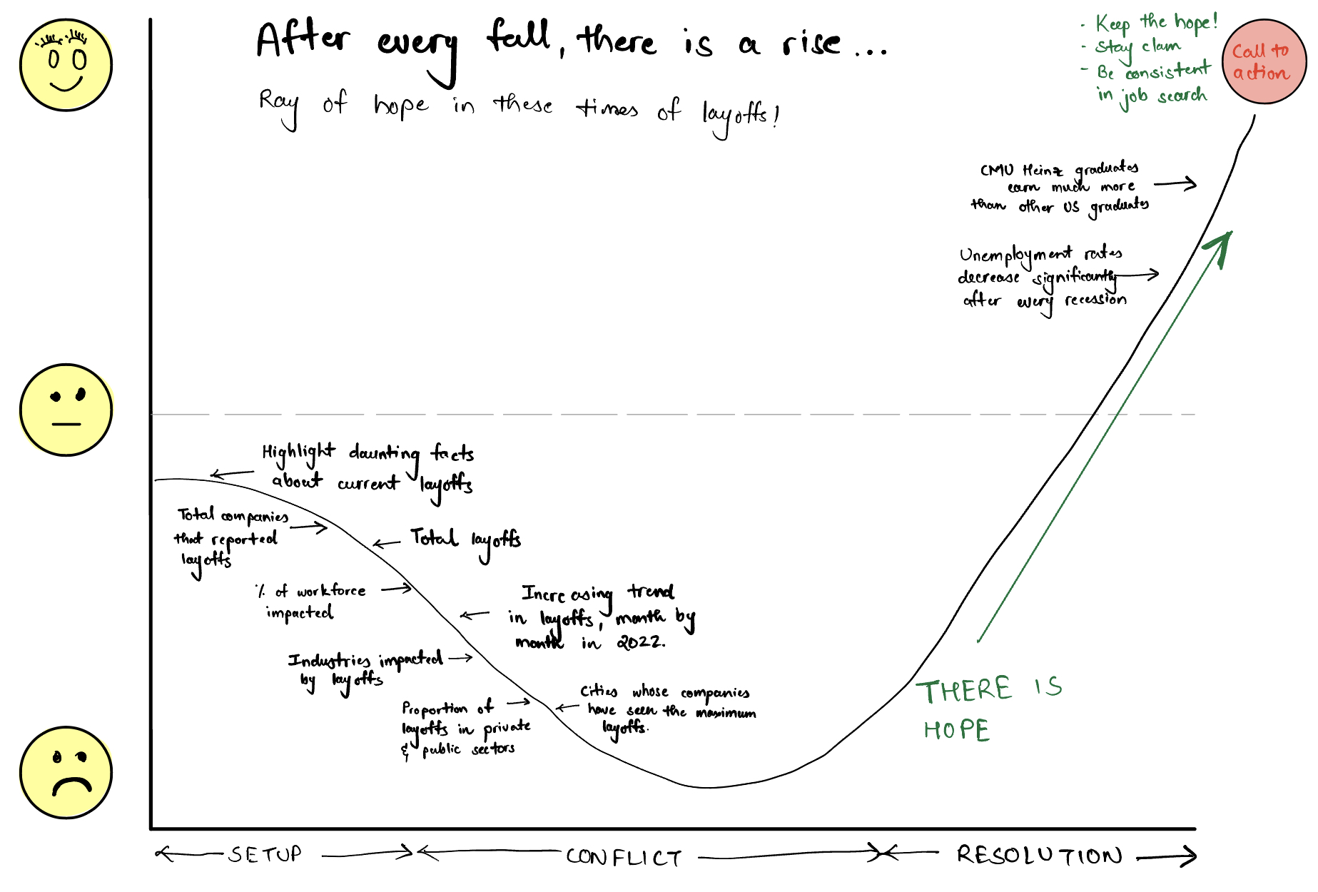
After every fall, there is a rise...
A ray of hope for CMU Heinz Graduates in these times of layoffs.
Part 1: Outline
Summary 📝
- These are challenging times. We are going through a difficult phase of life. The job market is crashing, and there are layoffs all around. Inflation rates are booming in the United States, and finding jobs is getting harder. Are we entering a recession? Maybe. Or maybe not! Many students, especially new grads, may feel hopeless about the future in such a situation. I have seen many students in this situation. But I firmly believe that there is hope.
- The primary audience of this project is the master's students at the Heinz College at Carnegie Mellon University. Through this project, I wish to highlight the current trends in the job market, primarily focusing on the layoffs that have occurred in 2022.
- After highlighting the trends and the current layoff scenario, I emphasize two facts. The first is that unemployment rates have decreased significantly after every recession. The second fact relates to CMU Heinz graduates outperforming the other US graduates (in terms of salaries) over the past years. CMU's Heinz graduates have great potential, and their potential is a big hope for their future! Consistency and a proper approach are all required in these challenging times.
User Story and Call To Action 📝
- As a reader, I want to understand the current job market (layoffs) scenario and the hope that exists for me so that I can be hopeful about my future and stay calm. I can do this by being calm, and consistent and by following a proper job search approach.
Project Structure 📝
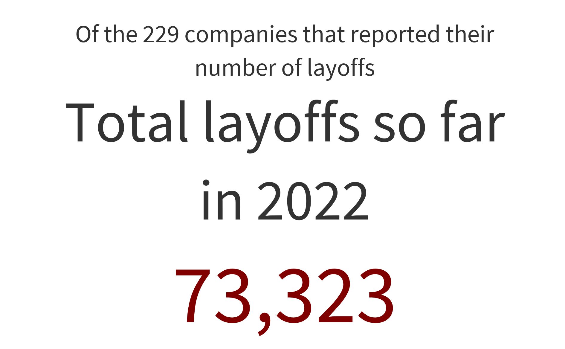
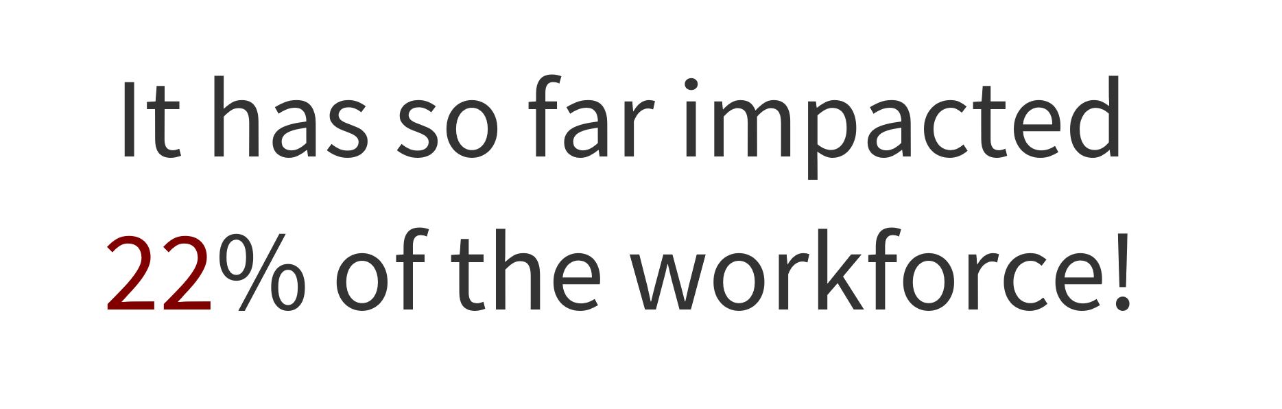
- Setup: For the setup, I would highlight a few daunting but authentic facts about the current layoff scenario. These would include the total number of companies that have reported layoffs in 2022, the total number of reported layoffs, and the percentage of the workforce that has been impacted so far.
- Conflict: I would move on with visualizing the trends in the layoffs. I would highlight the industries that have been impacted, the proportion of layoffs in the private and public sectors, the cities whose companies have seen the highest layoffs, and the increasing trend of layoffs month by month in 2022.
- Resolution: Despite the above, there is hope. I highlight the fact that unemployment rates have decreased significantly after every recession. And I put forward that CMU's Heinz graduates have great potential compared to the other US graduates. This is the least possible ray of hope that I want current Heinz graduates (who are too worried about their future) to hold onto.
Story Arc 📝
Audience 📝
- The primary audience of this project is the master's students at the Heinz College at Carnegie Mellon University.
Part 2: Initial Sketches
1. Setup
A few daunting but authentic facts about the current layoff scenario. It would help understand the ground reality.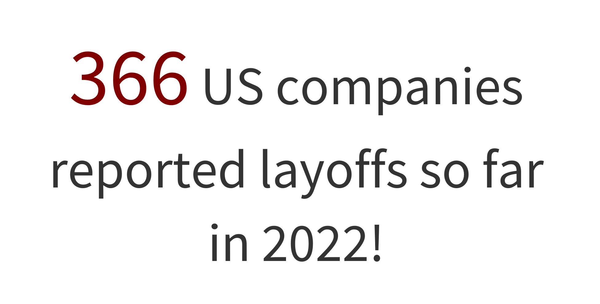

2. Conflict
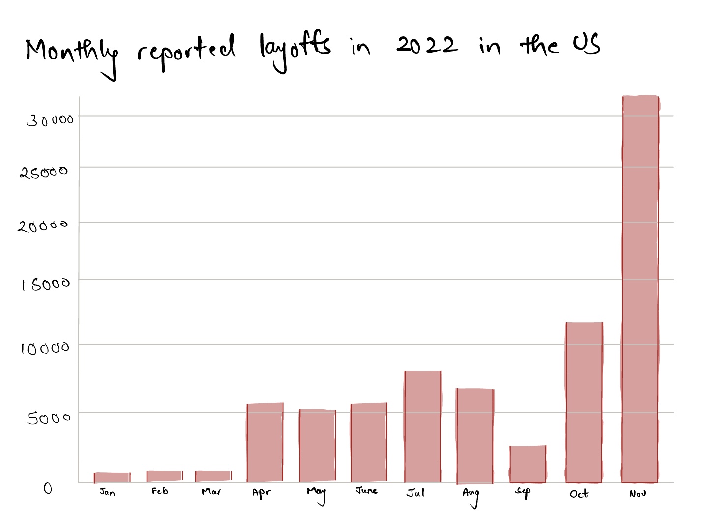
Visualizing the trends in the layoff season - Industries that have been impacted, the proportion of layoffs in the private and public sectors, the cities whose companies have seen the highest layoffs, and the increasing trend of layoffs month by month in 2022.We learn that the monthly layoffs in the US in 2022 have exponentially increased in the final quarter.
I plan to highlight the industries that have seen the highest layoffs. Initially, I decided to show the top few industries whose companies have seen the maximum layoffs. Hence, I came up with the following bar chart. But after getting my hands dirty in Flourish, I designed the word cloud that follows. However, it seemed a bit messy, so I changed it to a treemap showing more industries that have been affected (along with highlighting the top 4). I would not let the word cloud go in vain. I would probably take its screenshot and use it in my final shorthand.
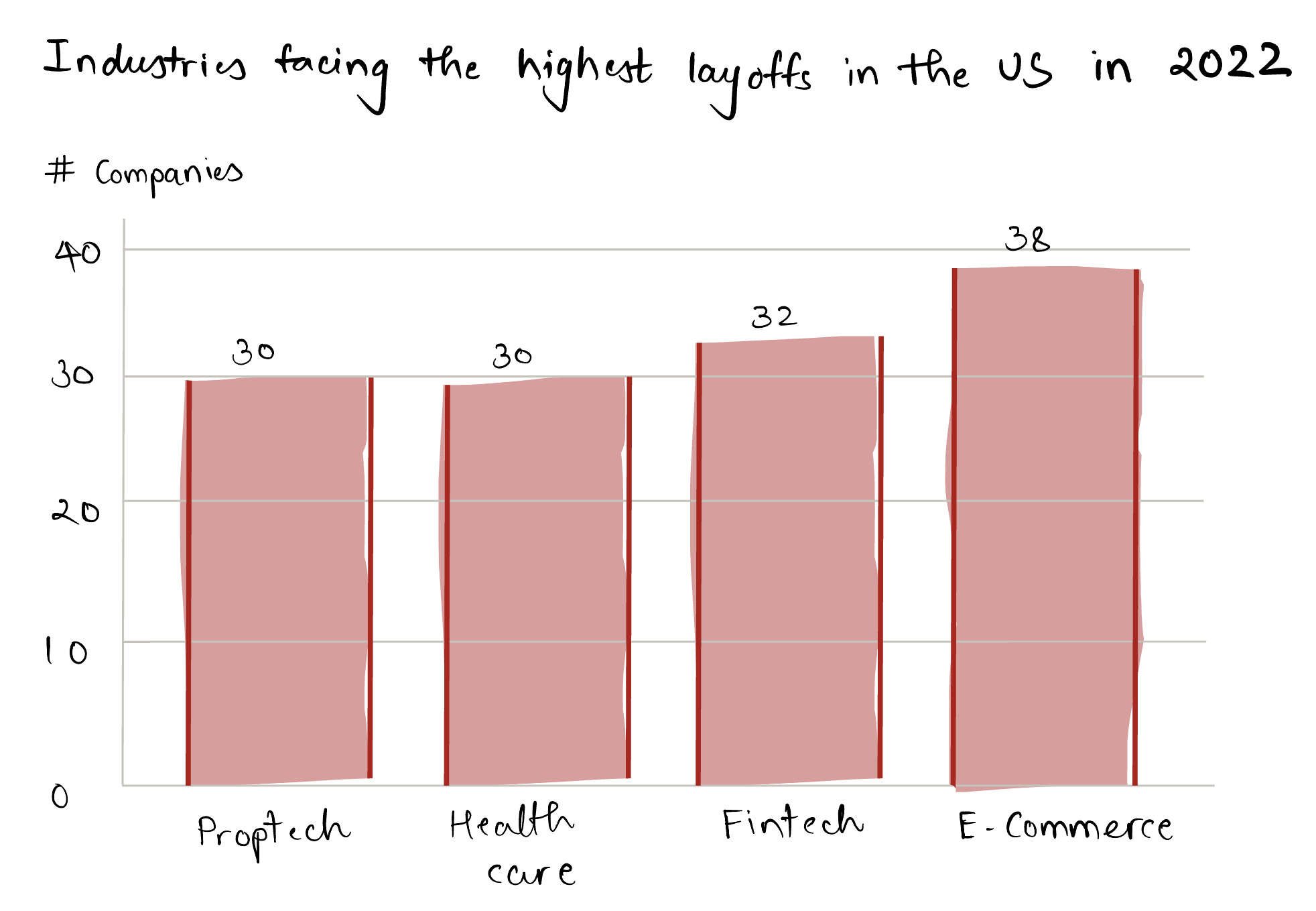
Industries facing the highest layoffs in the US in 2022

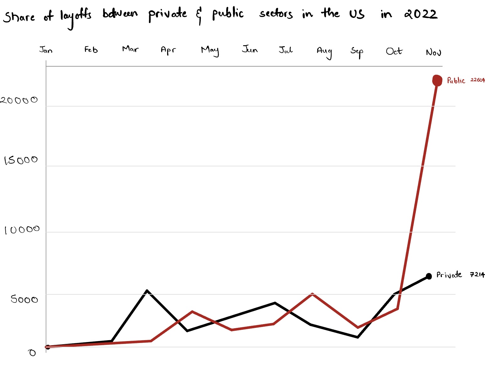
Next, we learn that the public sector has been more affected than the private sector. On a side note, the rise in the private sector is also due to Twitter turning private recently after Elon Musk bought it.
It is required to know the cities that have been greatly affected by the layoffs. From the following Circle Hierarchy chart, we learn that almost all major cities in the US have been affected by the layoffs, with the tech hubs being at the top.
3. Resolution
Despite the above daunting trends and facts, there is hope. In the final section, I highlight that unemployment rates have decreased significantly after every recession. And I put forward that CMU's Heinz graduates have great potential compared to the other US graduates. This is the least possible ray of hope that I want current Heinz graduates (who are too worried about their future) to hold onto.From the below chart, we see that the US sees a significant decrease in unemployment after every dull period of recession where the unemployment rates increase. This is a positive sign and a small ray of hope. If we were to enter a recession, everyone would be in it, but things would be fine after that.
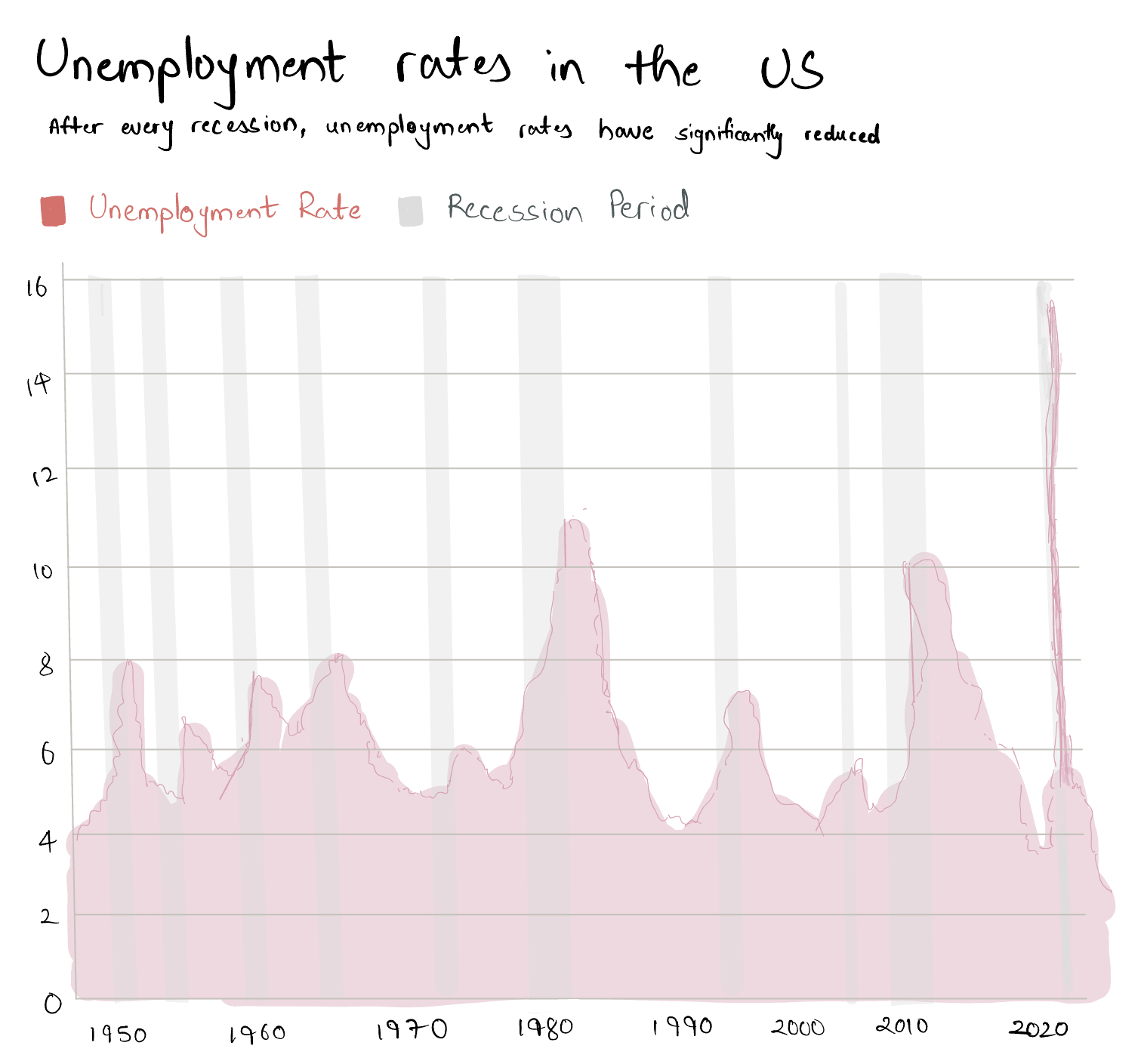
Source: FRED Economic Data, US Bureau of Labor Statistics
The biggest ray of hope that I wish the students to go away with is to understand the potential that they have developed at CMU! The below line chart indicates that CMU's Heinz graduates earn much more than the other master's degree holders in the US.
Part 3: Data
Data Source 1: Crunchbase
- This is my primary data source for analyzing the layoff trends in the US in 2022.
- It has the company's name, the number of reported layoffs, % of the workforce impacted in the company, its headquarters, its status (private or public), the date it announced the layoffs, and its industry.
- The original data source was messy. For example, the entire date was in one cell, and multiple industries were in one cell. I separated these into different columns and generalized the data further by replacing 'AI' with 'Artificial Intelligence', 'IT' with 'Information Technology', 'Ecommerce' with 'E-Commerce', and 'AR' with 'Augmented Reality'.
- Cleaned Version: Link
Data Source 2: CMU Heinz College Employment Statistics
- I used this data source to get the median salary of the different programs at the Heinz College at CMU over the past years, from 2014 to 2021.
- It is used to generate the line chart of the median salaries, which are compared with the median salaries of the master's students in the US in general.
- The original data source is available in PDF form. I manually copied the values to create the data set that I required.
- Cleaned Version: Link
Data Source 3: National Center for Education Statistics
- This data is used to get the median salary of a master's degree holder in the US over the past years, from 2014 to 2021.
- It is used to generate the line chart for comparison with the salaries of CMU Heinz graduate students.
- Cleaned Version: Link
Data Source 4: US Bureau of Labor Statistics
- This source is used to get the unemployment rate in the US from 1948 to 2022.
- It compares the unemployment rates during and after the recessions in the USA.
- Cleaned Version: Link
Data Source 5: FRED Economic Data
- Finally, this source is used to get the periods of recession in the USA.
- The recession periods are used along with the unemployment rates to understand the trend in unemployment during and after a recession.
- Cleaned Version: Link
Part 4: Method and Medium
- Moving forward, I am planning to polish up my visualizations. My main focus would be to develop digital interactive visualization for the 'Unemployment Rates in the US' chart. Due to time constraints, I could not develop a digital interactive version at this point.
- I am also planning to restructure the Circle Hierarchy chart to represent states as the major circles and cities as minor circles in the states. I would also try to generalize the industries in the treemap to create sub tree maps if possible.
- I would use Shorthand to develop my narrative for the final project.
- I plan to mainly use Flourish to develop my final visualizations, but if I come up with ideas more suitable for Tableau, I have kept it (Tableau) in my toolkit.
- For developing the narrative for my final project in Shorthand, I plan to use attractive license-free images by Unsplash.
Portfolio Navigation 🏃🏻
- Home Page: Going back to the start...
- Assignment 1: Setting up an online portfolio for the course (this website!)
- Assignment 2: Visualizing Government Debt
- Assignments 3 and 4: Critique by Design
- Final Project - Part 2: Creating Storyboard and User Research
- Final Project - Part 3: Incorporating User Research and Final Touches